

CONTEXT
PROBLEM
RESEARCH
PROCESS
SOLUTION
IMPACT
REFLECTION
CONTEXT
The design process for creating our admin back-end system, Dash.
MY ROLE
Senior Product Designer
TEAM
Product Manager, Tech Lead, QA
TOOLS
Figma, User-Interviews, Questionnaires, Hotjar
Jitjatjo is a technology company operating a multi-sided talent marketplace. Their admin teams; recruitment, customer service, HR, operations, and system administrators, required a unified back-end platform to manage talent, clients, jobs, matching, payments, and operational issues.
“Dash” is the internal admin console where data from all three Jitjatjo applications converges. As the product designer, I was responsible for the design, development support, and ongoing evolution of this critical internal tool.
My Role: I was responsible for the end-to-end design, evolution, and upkeep of Dash, including user research, UX strategy, UI design, prototyping, system architecture, component design, and collaboration with engineering.
CONTEXT
PROBLEM
RESEARCH
PROCESS
SOLUTION
IMPACT
REFLECTION
PROBLEM
Tedious Workflows Hindering Efficiency
While Dash already existed, it lacked structure, consistency, and clarity as the product and company scaled. I identified core problem areas where the system was falling short.
CUMBERSOME REPORTING AND ACTION TAKING
A lot of manual process needed to take place in order to identify and rectify issues. Finding the right information (if it even existed) in an appropriate time frame to action.
RELYING ON 3RD PARTY TOOLS
A large amount of our data is handled “off-site” with 3rd party integrations, making it an extra step admins had to take to view multiple locations in order to receive the data they needed.
Hierarchy of information
Depending on the admin type, some information wasn’t available for certain user-groups resulting in missed or inaccurate actions taking place.
CONTEXT
PROBLEM
RESEARCH
PROCESS
SOLUTION
IMPACT
REFLECTION
RESEARCH & INSIGHTS
Because our “customers” were internal, I had direct and frequent access to the people using Dash:
Admin interviews to understand workflows, pain points, and where information was missing or overwhelming.
Slack issue-channel analysis where real-time operational problems surfaced, showing how admins triaged urgent issues and what information they needed at each step.
Role-specific conversations to identify what each admin type needed to see first and most often.
Usability observations of admins using existing pages to reveal where data hierarchy and priority needed restructuring.
Through this research period, I uncovered the following key insights:
COMPLEX & EXPANDING DATA
Admins needed to navigate large quantities of job, client, talent, and algorithm data, often under time pressure.
DIFFERENT ADMIN ROLES WITH DIFFERENT NEEDS
Recruiters, service‐delivery admins, and HR teams required visibility into different data sets and workflows.
OPERATIONAL ISSUES (”FIRES'“) WERE DIFFICULT TO TRIAGE
Alerts and problem states weren’t clearly surfaced in context, making it slow to act on urgent situations.
TRANSPARENCY IN PAYMENTS ACROSS MULTIPLE MARKETS
Pay structures varied between the US, Australia, and Israel, leading to confusion without a clear breakdown.
INCONSISTENT PAGE STRUCTURES
Without templates or a design system, pages grew inconsistently as new features were added.
MOBILE RESPONSIVENESS LIMITATIONS
Heavy data tables and dense workflows made it clear that not all admin functions translated well to mobile.
CONTEXT
PROBLEM
RESEARCH
PROCESS
SOLUTION
IMPACT
REFLECTION
PROCESS
Lean, iterative approach
We prioritised speed: create low-fidelity prototypes, test rapidly with admins, then refine. Admin users were available daily, which made continuous iteration extremely effective.

Low-fidelity templates
I created baseline templates for core page types:
List views
Detail pages
Forms and modals
Payment summaries
Issue overlays
Dashboards
These structures became foundational templates, ensuring uniformity while remaining flexible for specific needs.
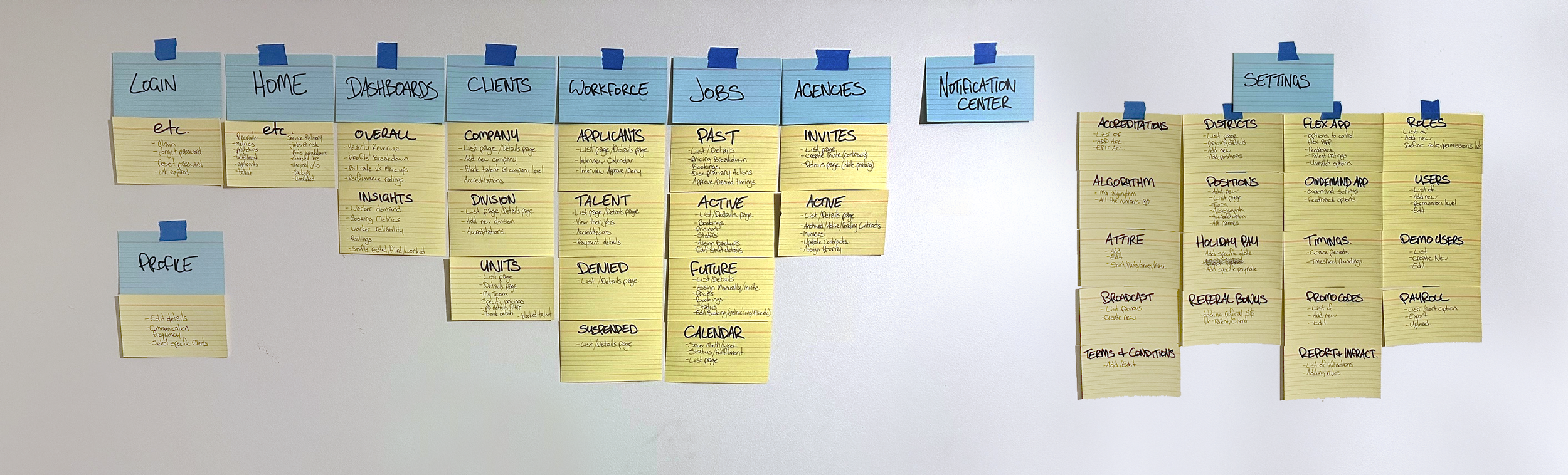
Component-based design
As the system matured, components were formalised into our design system, ensuring visual consistency, predictable behaviour, and future scalability.


CONTEXT
PROBLEM
RESEARCH
PROCESS
SOLUTION
IMPACT
REFLECTION
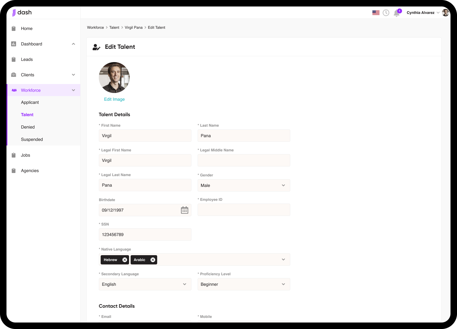
SOLUTION
Some key redesigned areas included:
Role-based home screens
Since each admin type had different responsibilities, I designed multiple versions of the home screen, each surfacing the most relevant information:
Recruiter/HR view
Service delivery view
This significantly reduced noise and time to action.


Calendar View
Admins needed a visual scheduling tool beyond simple job lists. Inspired by tools like Google Calendar, I created:
A pill-based month view
Expandable daily timelines
Quick access to job details and job state

Metrics Dashboard
We transitioned away from relying solely on Grow.com due to styling limitations.
The new dashboard surfaced:
Revenue & profit
Client breakdowns
Trends and comparative insights
All presented in a way that was clear at a glance, and allowed for further deep dives if needed.


Payment Transparency
I designed a detailed pay breakdown system to account for:
Base pay
Casual loadings
Penalty rates
Overtime
Market-specific pay structures (US salaries, AU salaries, Israel salaries)
Add-ons such as travel or promo codes
This helped for occasions when there may be discrepancies by bringing clarity and reduced back-and-forth between admins and talent.


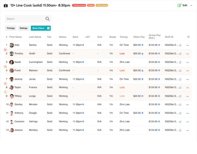
Operational Issue (“Fire”) Handling
I embedded issue indicators directly into the places admins work:
Inline job and talent alerts
Severity levels (major / mid / minor)
Job status bars
Contextual information so admins could act immediately

Mobile Responsive
We aimed to keep Dash usable on mobile, but several challenges emerged.
Large volumes of content (especially tables) didn’t translate well to small screens.
Horizontal scrolling and dense data made the mobile experience technically possible but not ideal.
Because of these limitations, we encouraged admins to primarily use the desktop version for the best experience.


CONTEXT
PROBLEM
RESEARCH
PROCESS
SOLUTION
IMPACT
REFLECTION
IMPACT
Operational Efficiency
Admins could find critical information faster, reducing time spent jumping between systems or views.
Improved Decision-Making
Leadership gained better visibility into KPIs, trends, and anomalies.
Reduced Payment Confusion
Clear breakdowns lowered talent disputes and simplified admin support.
Faster Response to Issues
Embedded, contextual issue handling allowed admins to resolve urgent problems much more quickly.
Scalability
Templates and reusable components meant new features could be added easily without compromising consistency.
High Engagement with Users
The iterative feedback loop fostered a strong relationship between product and internal teams, ensuring the system matched real-world needs.
CONTEXT
PROBLEM
RESEARCH
PROCESS
SOLUTION
IMPACT
REFLECTION
REFLECTION
Internal products deserve the same design attention as customer-facing ones.
Role specificity matters: tailoring dashboards to each admin group was one of the highest-impact decisions.
Data-heavy tools don’t always need to be fully responsive: forcing mobile compatibility for complex tables can harm usability more than help it.
Iterative design + direct user access = powerful outcomes.
Building templates early prevents design debt later.
Dash ultimately evolved into a clear, robust operational hub that supported Jitjatjo’s growth across multiple markets.