
myCompass
Designing the self help website

Overview
The BlackDog Institute required a refresh of their MyCompass self-help website, which dates back to 2006. There were three sections to focus on for the redesign, the marketing page, the dashboard/tracking pages and the module pages. The website also needed to be available on mobile devices.
The original website was completely outdated and lacked any kind of approachability.
As Lead Web Designer, I worked closely with our Account Manager and directly with the client during the re-design process.


The process
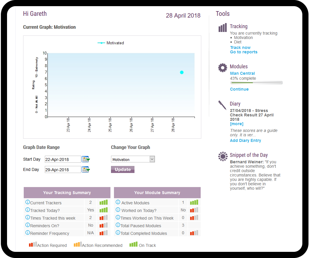
The timeline for the project was quiet tight, so after an initial white-boarding session, wire-frames were produced to cater for both a desktop and mobile solution, using the current content on the original website as a basis for the new. We knew that the daily tracking mechanic was going to be the main feature of the new product, so we kept that as a focus.

The marketing site
We used the marketing website as a guide for how the re-design was going to look and flow through the later pages. A huge focus was on making sure the site was easily digestible, clean look and feel with the information presented in order to welcome people (particularly those coming from a vulnerable place) and assure them that myCompass was a safe space for to work on their mental wellbeing.
We established early on, the ‘peaks’ and ‘troughs’ visual to not only be a metaphor for the state of an individuals mental health, but also to relate to the ongoing tracking that would also occur while using the app. The client loved this approach. From there I rolled out a few colour variations to choose from.


The application site
From there we rolled out the the templates for the rest of the site. This consisted of the main homepage once a user had logged-in, with the ability to add their daily metrics as well as see that weeks progression. The tracking page to do any deep dives into their analytics. Knowledge base that allowed users to research into various diagnoses.
Although the modules themselves were later rolled back to the original build, I also designed out the “front” page templates where a user can choose which self-help modules they would like to participate in as well as see the results and status of each individual module completed.


The result
Feedback from the client was well received across the board, given the hard timeframe constraints. They appreciated the new modern, sleek design and with it, had the confidence to reach-out to potential stakeholders when seasonal funding rounds began. They saw positive feedback from their user-base and the extensive tracking mechanic helped visualise various trend and triggers that may otherwise have gone unseen to folks in such vulnerable positions.